Full set of Perth Festival brochures and flyers with photography by myself

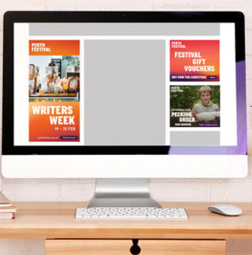
Writers Week brochure with dedicated gradient. I gave it a bright orange design including colour-coded event grids, a map and cross-promotion ads
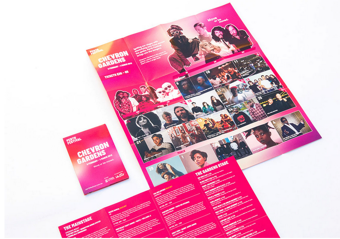
Chevron Gardens pocket guide with dedicated gradient
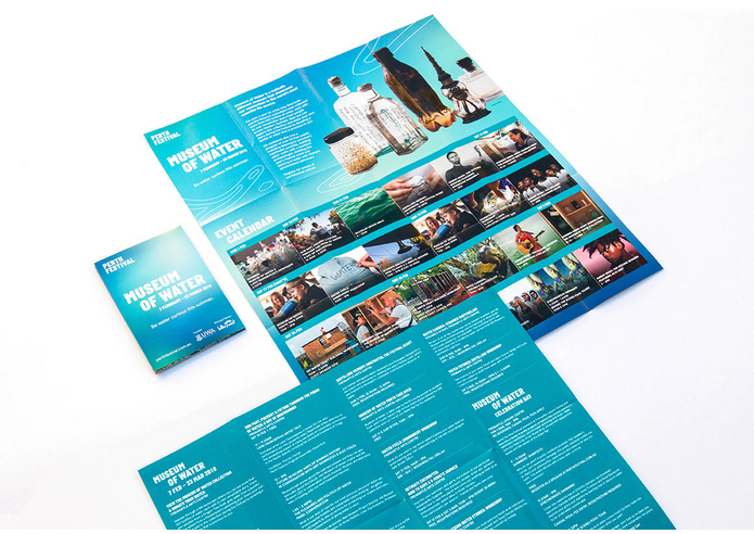
Museum of Water pocket guide with dedicated gradient
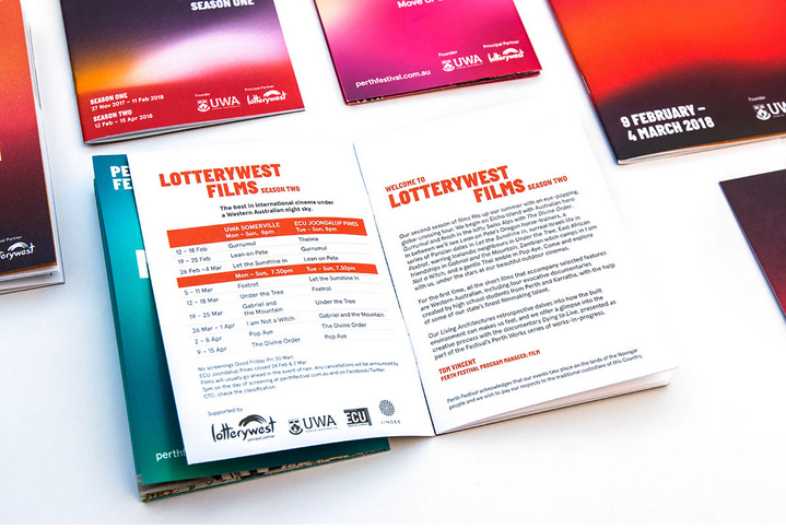
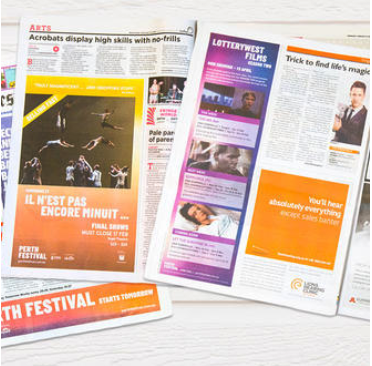
Lotterywest Films Brochures Season 1 and 2
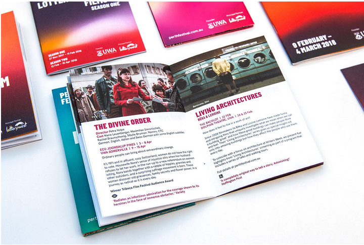
Lotterywest Films Brochures Season 1 and 2
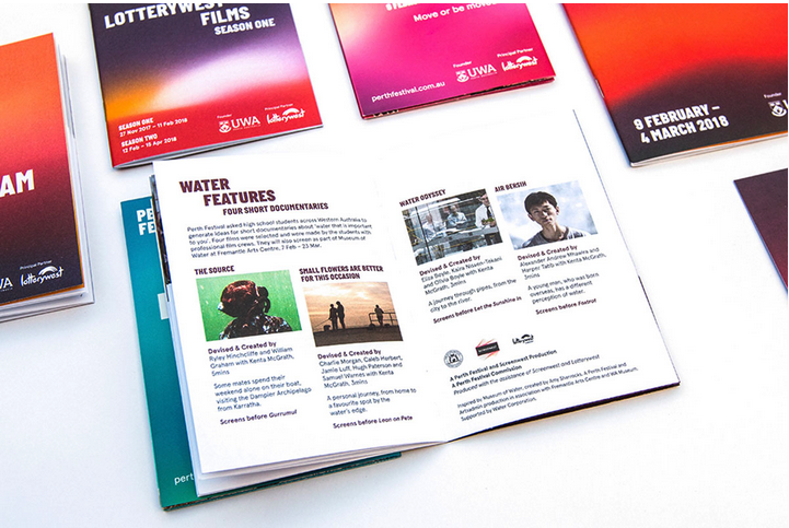
Lotterywest Films Brochures Season 1 and 2
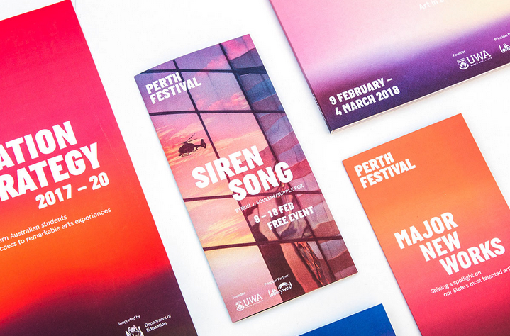
Siren Song event flyer (see Image Editing section)
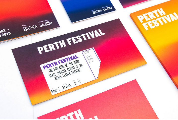
Design for ticket holder and ticket using Festival gradient
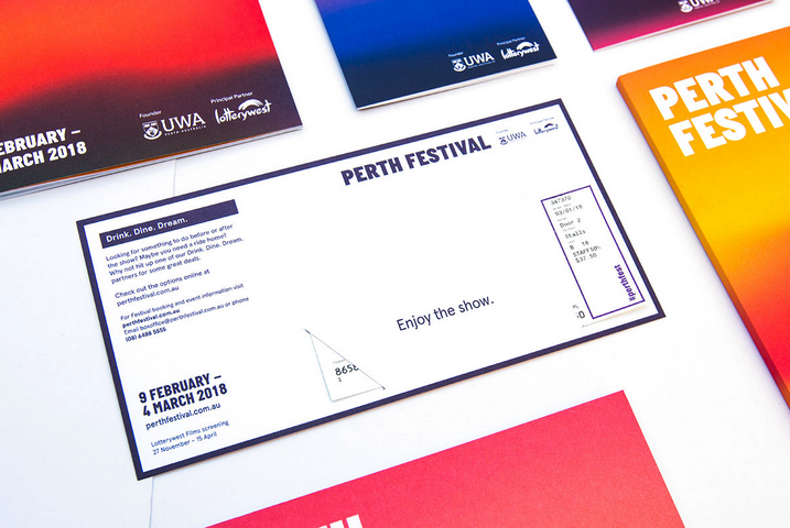
Design for ticket holder and ticket using Festival gradient
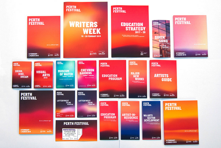
Full set of Perth Festival brochures and flyers
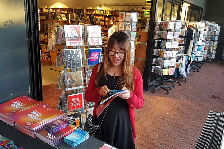
Brochures at bookstores around Perth (featured: Planet Books Mt Lawley)
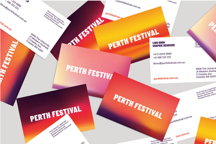
Business cards branded with Festival gradients
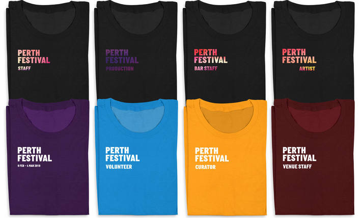
Festival shirts with different designs (Production was kept dark for backstage purposes). The blue and yellow shirts took on a sponsor's logo colours. Chevron Gardens staff kept to a Chevron Gardens gradient, Festival staff kept to a Festival gradient, and other plain shirts kept to Festival colours.
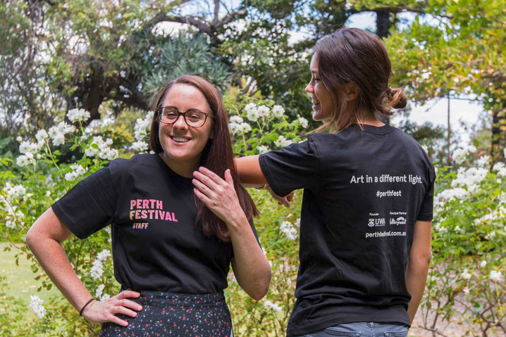
Staff shirt (front and back)
creative direction
about the project
Perth Festival (formerly Perth International Arts Festival) was rebranded by an agency before I came in. However, it lacked agreement on style and a clear branding guide. I worked with the Marketing team and Artistic Director, revamping and creating direction for various Festival components: Festival shows, Lotterywest Films, Chevron Gardens, Museum of Water, Writers Week, and Education.
—
I gave each Festival component its own look, dependent on its key colour and gradient. Four gradients were used only to brand the Festival as a whole. Chevron Gardens, Lotterywest Films, Writers Week each had their own gradients; show posters had gradients that matched their images; and one-off flyers featured one-off gradients.
—
Publications essentially set the tone for the rest of the marketing assets, from digital, to print, to signage.
In this way we achieved a consistent look across all Festival components while giving each of them an identity of their own.
services provided
Brand Development | Creative Direction | Publication Design | Marketing Collateral Design